Overview
Shopify lacks CMS Features. The Power Editor App brings CMS features to product, collection and content pages. It increases content management efficiency by providing Shopify admins with an excellent authoring experience.
It allows to capture additional content in a structured way. This content gets stored entirely within your Shopify instance. There is no lock-in. Even if you delete the app the content will still be available.
The app (or better: the content structure) has to be configured and implemented by an experienced theme designer.
Here’s a short intro video:
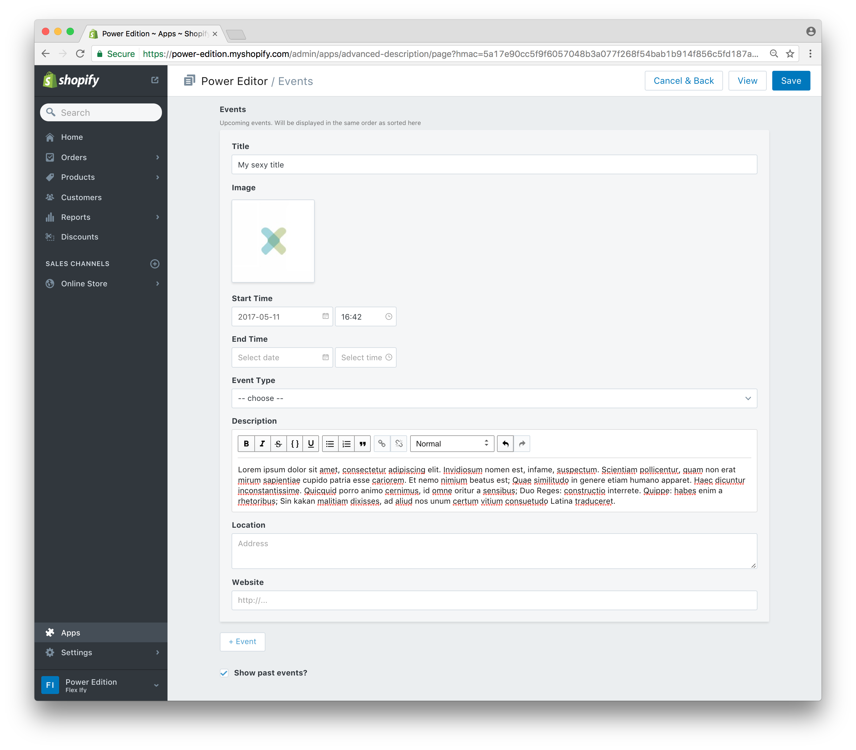
Field Layout
You model your content structure by defining a “Field Layout”.
Field types
html(Rich Text field)text(Plain Text)textarea(Plain Text with line breaks)integer,numberandrange(number input field)image(Image upload)checkbox(single checkbox)choice(select dropdown)product(product picker. This will store the product handle as value. Does only work for publically visible products.)date(date picker)dateTime(date-time picker)color(color picker)position(select position of elements)composite(super field)
The real star is the composite field type. It is a super field that contains a combination of fields of the other types. It allows you to create multiple blocks of the same content within a single field.
Field Attributes
name(How the field is labeled when presented to content editors)placeholder(Optional placeholder text for simple text fields)instructions(Optional instructions for content editors)handle(Key of the metafield the content will get stored in. ATTENTION: Shopify’s metafield keys have a maximum length of 30 characters. This means that every twohandleattributes that start with the same 30 characters will be treated as if the had the exact same value. Make sure the value forhandleis no more than 30 characters long)type(See above)template(Optional: A template suffix. If this attribute is defined the field will only be shown in the editor for the given template.)
Choice Field Attributes
These attributes only apply to the choice field type
choices(Array of possible values, e.g.["this", "that", "here", "there"])labels(Optional: allows defining custom labels for each option ofchoices. Array of the same length.)placeholder(The value will be used as the text for the empty option in the select dropdown)
Composite Field Atrributes
These attributes only apply to the composite field type
maxEntries(How many entries of the same composite field are allowed)schema(Field layout. Containing two or more fields specified by theirnameandtype)buttonLabel(Optional: Override the default label of the button that adds a new entry. The default label is the singularized name attribute prepended by a plus sign, e.g. if the field name isEventsthe button label will be+ Event)
Number, Integer and Range Field Attributes
minimummaximummultipleOf
These are not used for validating the fields but only as (min, max and step) attributes for the html5 input[type=number] and input[type=range] element used for numbers.
Color Field Attributes
default(Default color. Format is “red,green,blue,alpha” e.g. “255,255,255,1” for white with full opacity)
Position Field Attributes
choices(Array of possible positions. Valid values are["left", "right", "dropleft", "dropright", "center", "full"])
Textarea Field Attribute
rows(set the initial height of a textarea widget by specifying the number of rows)
Product Field Attribute
The product field has a few gotchas.
- The preview that shows the selected product in Power Editor will not work for password protected stores. Good news is, it’s just the preview. Under the hood the product handle should get saved into a metafield correctly.
- The picker dialog will show all products. Including those that are not set to be visible on the store front. That means that you (or your client) will be able to select products that can not be displayed on the storefront later via liquid theme code.
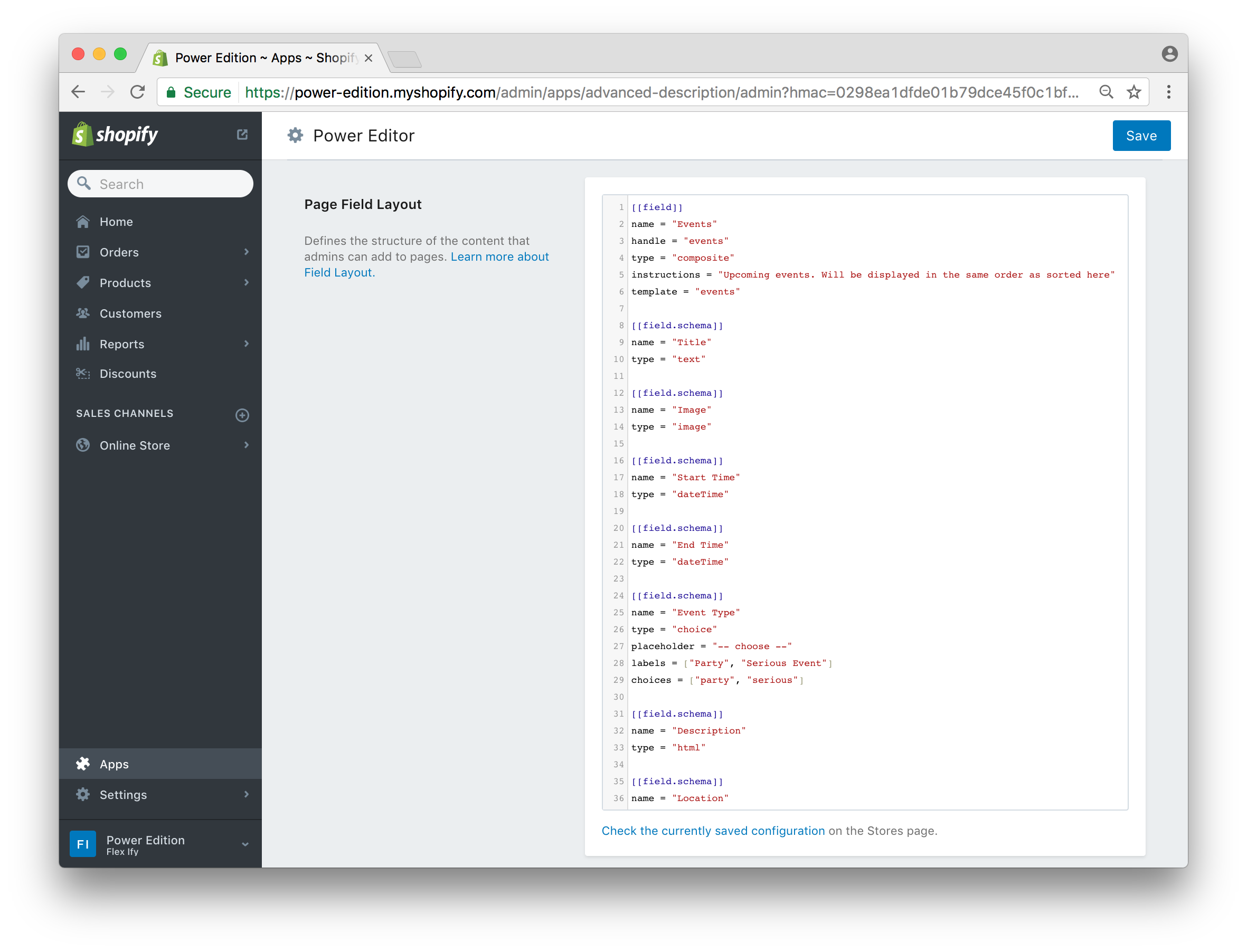
Configuration Format
There is no GUI to configure the field layout. We use a text configuration notated in TOML1 format
- A field definition is started with
[[field]]. - Each attribute is defined with
attributeName = "attribute value. - A definition of a field belonging to a composite field starts with
[[field.schema]]and contains exactly two attribute:nameandtype. - Comments start with a
#
Example
################################################
# First field definition of type "composite"   #
################################################

[[field]]
name = "Product Description Tabs"
type = "composite"
handle = "tabs"
maxEntries = 3
instructions = "Add tabbed description here"

# A child field as part of the composite field
[[field.schema]]
name = "Tab Heading"
type = "text"

# Another field as part of the composite field
[[field.schema]]
name = "Tab Content"
type = "html"

[[field.schema]]
name = "Is this the real life?"
type = "checkbox"

################################################
# Second field definition of field type "text" #
################################################

[[field]]
name = "A link"
type = "text"
handle = "link"
instructions = "Enter the URL of a site"
placeholder = "http://"

[[field]]
name ='Choose wisely'
handle = 'single'
type = 'choice'
placeholder = "choose one"
choices = ["1st", "2nd", "3rd", "4th"]
labels = ["this", "that", "here", "there"]
Storing Images
The app adds an unpublished theme to your store. This is where the images you upload get stored. It is our solution to the problem that Shopify does not provide a way to upload files through their API. The theme is called “DON’T DELETE (created by Power Editor)”. Please tell your Shopfiy admins to not delete it.
Displaying content with Liquid/Theme code
This is how you would loop through the composite field entries for “tabs” in your theme code:
{% assign rows = product.metafields["power-editor"]["tabs"]  | split: '<!--|row|-->'%}
 {% for row in rows %}
  {% assign cols = row | split: '<!--|col|-->' %}
  {% assign tab_heading = cols[0] %}
  {% assign tab_content = cols[1] %}

  <!--- YOU HTML CODE HERE -->

{% endfor %}
There are two things worth pointing out
- We’ll split up the metafield containing all the content into “rows” and the rows into “columns”. Each row represents a composite field entry. Each column in a row represent a child field of the composite entry.
- The order of the child fields matter. They show up in the same order that you defined them in the configuration step. In our example the first column,
cols[0], contains the tab heading and the second column,col[1], contains the tab content.
Example continued
To show the tabs on our product pages we could use the approach outlined in the Shopify help center article “Add tabs to product descriptions”.
Following the article, you will be adding three tabs to all product pages. In the first tab, you will load up the product description. In the other tabs you will load up the power editor content from the composite fields with the handle “tabs” that you configured above.
Just follow the article and when it is time to “Edit sections/product-template.liquid” use the following liquid code
{% assign rows = product.metafields["power-editor"]["tabs"]  | split: '<!--|row|-->'%}
<div>
  <ul class="tabs">
    <li><a href="#tab-0">Info</a></li>
    {% for row in rows %}
      {% assign cols = row | split: '<!--|col|-->' %}
      <li><a href="#tab-{{ forloop.index }}">{{ cols[0] }}</a></li>
    {% endfor %}
  </ul>
  <div id="tab-0">
    {{ product.description }}
  </div>
  {% for row in rows %}
    {% assign cols = row | split: '<!--|col|-->' %}
    <div id="tab-{{ forloop.index }}">
      {{ cols[1] }}
    </div>
  {% endfor %}
</div>
More examples
You can find more examples at the shopify-powereditor-examples Github repository.